Negative space is one of the most effective design elements.
When used correctly, it enhances all other aspects of our work. But if neglected, it can destroy all chances of success.
Despite its power, most people never learn to see negative space for what it really is, and because of that, never maximize its full potential.
This article covers:
What is negative space?
Wikipedia tells us it’s “the space between and around the subjects of an image.” If I ask someone what negative space is, they’ll most likely think of an example or two they first saw in grade school.
It seems simple, but its simplicity is an illusion, just like the simple optical illusions in black and white that first come to mind.

I always think of Rubin’s vase.
I was in second grade when I first saw it. My hyperactive brain dismissed it immediately as a boring picture. But then, suddenly, I saw the faces.
It felt like my brain malfunctioned, yet that sensation was strangely enjoyable.
Why?
The sense of discovery.
Children are filled with wonderment because everything in the world is new and exciting.
While aging, it’s common to have that sense of pure enthusiasm fade. Because of that, imagination softens, and there becomes less that can surprise and shock.
But even as adults, when we find something new, like an image hidden in plain sight, that spark of excitement finds its way back to us.
Even if just for a second, negative space can give us a sense of wonderment.
These two covers for Noma Bar’s books are prime examples:


I’d be remiss if I didn’t mention M.C. Escher, whose mind-bending illustrations use negative space to explore mathematical relationships in art:


While not as well known, I have yet to hear of someone who doesn’t appreciate this clever piece by Barcelona-based artist Pejac:

Logos with negative space amplify these effects.


Great logos share great qualities—such as distinctness, identifiability, relevance, and contrast. But because logo design requires balancing between saying too little and saying too much, it’s hard to achieve all of these traits at once.
Negative space can help find that balance.
Negative space amplifies the effectiveness of logo design through its radical ability to add value by subtraction.
Some take a bold approach with high contrast while staying compact.


Others leverage subtlety.


Some use negative space to add clever relevance.


Others don’t just use negative space. They master it.


The truth is that logos don’t really want to hide anything.
They want to be identifiable, distinct, and memorable, and because of this, they hide their secrets in plain sight.
The response we feel is universal.
Our response is wired into us biologically and is largely unavoidable.
Negative space taps into the part of our brain that’s always automatically searching for patterns and hidden information.
The process of discovery enchants us, and that emotional response can be leveraged to create exceptional results.
Negative space hides.
We frequently see negative space in art and logos, but that’s only when it’s most apparent.
It hides in plain sight.
Negative space is all around us because design is all around us.
Negative space isn’t black and white; it’s yes and no. It’s the delicate balance of inclusion and omission.
We can find it in our roads, cars, and architecture—including every room in your house. And all cups and bowls would be useless without negative space.
Additionally, it’s on every screen on every device as part of every app and website, influencing all user experiences in the digital world.
It doesn’t just affect our eyes. It affects our minds.
Negative space can elicit an emotional reaction by triggering a process of intrigue, exploration, and discovery.
Artistically, it’s able to spark the imagination by mixing whimsy and playfulness.
Strategically, it’s capable of not only leading the viewer’s eye but controlling their entire journey.
Understanding the full power of negative space will allow you to create more decisive results. However, to do that, you need to see it fully in action.
Negative space in web design
Negative space in web design is often called “white space” or “empty space.” Its uses are different compared to in other media, but it’s even more important.
Do any of these sound familiar?
If you’re like me, you instantly leave and find a different, better site.
Websites that don’t embrace empty space only end up with empty messaging.
Expert brands do know this fact. Just look.
Great examples of websites using negative space:
Clearbit flawlessly delivers concise messaging:

Baremetrics, a leading analytics company, loves empty space. With the sheer amount of data they analyze, it’s safe to assume their approach is driven by results and not aesthetics:

The Bill & Melinda Gates Foundation has a message so powerful it’s far more impactful to have it stand alone:

Asana’s entire site thrives by using white space to highlight the platform’s key benefits and features:

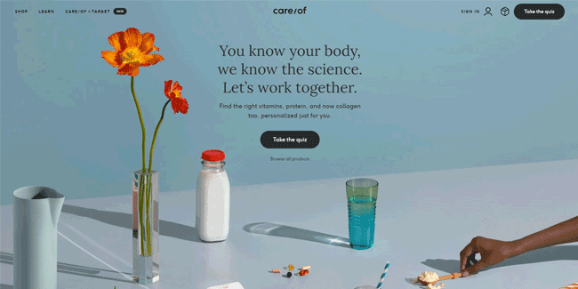
Care/of does an excellent job of proving white space doesn’t have to be white:
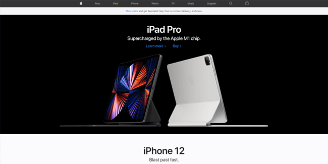
Ever hear of a little company called Apple? Each section of their site is a pedestal for one specific focus, and nothing else:
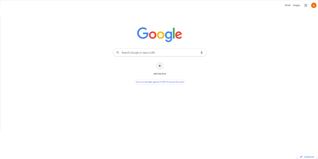
And then there is the true master of white space, Google. Google’s legendary homepage directs you to the main actionable item – a door to the internet:
Even Google’s search results page utilizes less than half the screen on desktop displays. Google knows what you’re looking for and leads you directly to it without distraction:

What’s the real reason top brands don’t add more to their pages?
Is it because Google is just lazy? Does Apple not know how to design pages that aren’t half empty? Can’t multi-billion-dollar companies figure out what else to add?
Don’t be silly.
It’s because they know a secret:
Negative space can be used for mind control.
Ok, not literally—but close enough.
Let me explain:
You have significant psychological hurdles to overcome when designing your UX.
If you give your users tons of options, they take longer to make choices. If you overload them, they never choose.
While it’s compelling to explain everything you offer, more elements will dilute your core message. Similarly, you want to be thorough, but people don’t like to read. They prefer to skim.
You can’t add a solution to solve these issues. Instead, you must subtract.
White space is the solution.
Reducing what’s on the page gives you control over your users’ choices and when they make them.
Removing elements helps highlight your core messaging. So you gain control of the users’ focus.
Furthermore, prioritizing white space makes your website’s sections skimmable yet still impactful, and the breaks improve user comprehension.
White space allows you to more effectively optimize the user journey and build towards your call to action.
When you limit what’s on the page, your users’ subconscious screams “This is important!” about everything they see.
How to use negative space in web design.
Consider these guidelines when designing your next website:
By following this guidance, your site will have less friction and produce better results.
Conclusion
Negative space is a key design element that’s continually underappreciated, but only because people don’t realize the extreme power it holds. If you learn how to wield it, you can produce exceptional results in any design format.
Use of negative space can:
Negative space is not a negative.
Less is more.
